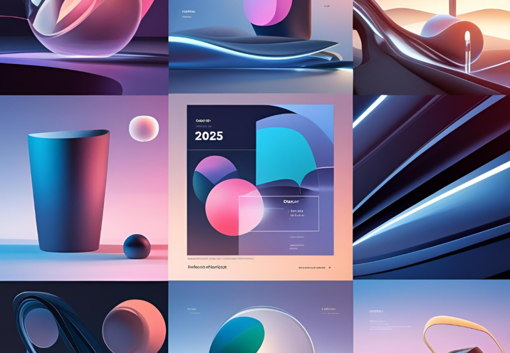
Use of Graphic design principles for appealing designs is what it takes to make beautiful designs and mastering key graphic design principles. However, design goes much further than beauty; it is a communicative form of conveying ideas through a medium. Be it with graphic design, interior design, product design, or architecture, basic principles remain common. Just as other fields uphold certain base rules that address balance, harmony, and visual clarity, so does good design. By understanding Graphic design principles for appealing designs , you can create a beautiful and functional presentation that leaves a lasting impression. Now learning about Graphic Design Principles For Appealing Designs allow any designer to make their work look clean, balanced and professional.
Likewise, DesignMocker is a free tool you can use to create packaging mockups. It’s simple, useful and works right in the browser. The most important aspect of this it’s 100% free – no signup required and no hidden charges applicable. You can start creating stunning design mockups instantly and download the same without any watermark.
What’s the Importance of Graphic design principles for appealing designs
Balance is one of the most imperative aspects of a design. It gives stability and prevents any design from feeling chaotic. The two broad categories of balance are symmetrical and asymmetrical. By knowing graphic design principles for appealing designs your audience will literally see and interact with your content.
Symmetrical balance is when every element is distributed equally on either side of the imaginary axis. It gives a feeling of orderliness and organization in the design, thus making it feel very professional. Symmetrical balance is generally made in formal kinds of patterns, such as traditional architecture and corporate branding.
Asymmetrical balance is achieved using sizes, colors, and placement. The arrangement of different elements creates an interesting composition that brings about a balance composed of elements that are not equal in weight. This is often adopted in modern and creative designing to give a sense of movement or energy without having a specific direction or sameness created in a symmetrical balance. There are many brands which mainly rely on graphic design principles for appealing designs to build trust and standout amongst its counterparts. When you want to make some popular design the first step to know the 7 principles of graphic design to improve so that your work look balanced, and professional.
Now you know how important design principles architecture plays a role in functionality, aesthetics and sustainability.
The Role of Contrast in Enhancing Visual Impact
To separate the design from any design, we use contrast. This distinction helps visual elements and spotlights particular areas. Contrast can be made with color, size, shape, and typeface.
A dark background with bright letters makes the content more readable. The same would go for designs involving large and small elements that act as contrast in the perspective of depth and hierarchy. Without contrast, it sometimes feels plain or boring.
Some subtlety between striking contrasts creates engaging compositions. Design principles architecture plays a crucial role in bringing functional yet pleasing and robust spaces. Thus, it requires contrast, rhythm, and contextual awareness to be in place. By integrating these together you can blend with practicality.
Harmony: Bringing Cohesion to Design
Simply put, harmony is what gives a design an overall unity. It makes sure that every element works together and that when it leaves, it doesn’t feel disconnected or overwhelming.
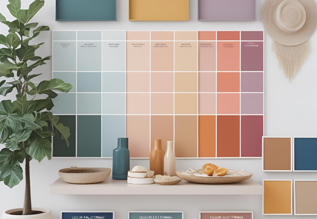
One way of achieving harmony is to ensure a consistent color palette. Using Graphic design principles for appealing designs acts as a compliment or at least analogous colors allows the designer to build a smooth visual flow. The same goes for typography; using a consistent typeface throughout the design project helps in creating brand identity and professionalism.
Textures, shapes, and patterns should also respect this same philosophy, as adding too many, too diverse elements can cause havoc in the visual balance. Artificially harmonious designs feel natural and pleasant to your eye. AI design principles are guided by experiences and allow seamless interactions. Most AI design principles focus on ethical considerations, bringing more transparency and fairness to the data through the system.
The Significance of Alignment and Structure
Alignment is another element that organizes and makes a design more readable. It forces the intentional placement of design elements, as opposed to random placement. Therefore, alignment makes text easier to read while guiding the viewer’s gaze through the design.
Different alignment techniques—for example, left or right, centered, or justified—are adopted by designers, depending on the nature of the design. To help designers maintain their alignment and structure, grid axes are often utilized in both web and print design. These Graphic design principles for appealing designs which act as a guide to properly align and create an image of a polished product and careful attention is being paid to every small detail.
The Power of White Space
The spaces devoid of any design elements are referred to as white spaces or negative spaces. Though it’s often not given attention, it actually makes a significant mark in turning usability into readers and focus. If a design dose too many features, it’s always a mess for the viewers to navigate.
Through good use of white spaces, designers will be able to create an air of elegance and clarity. They give a rest to the viewer’s eyes and push the notice of salient elements. White spaces always speak of modernity and refinement, be it in typography, website design, or even in product packaging.
Emphasis: Directing Attention to Key Elements
In the Graphic design principles for appealing designs, we emphasize it and serves to guide the attention of audiences towards the most significant aspect of a design. This can be typically achieved through color, contrast, size, or positioning.
In advertising for example, a call-to-action button usually had bright colors to know people and engage with them from far a distance. Similarly, large headlines appear often in magazines to grab the attention of the audience exact at the point where it is meant for.
The issue, message, or meaning is conveyed prominently with good emphasis without being distracted. Most designers who are doing good with their designs credit their success by learning the 7 principles of graphic design that not emphasis on different elements such as balance, contrast and alignment.
The Role of Repetition in Creating Consistency
Repetition strengthens a design through the reinforcement of patterns and behavior. It helps in creating recognizable style and brand identity. By repeating an element across various media, such as font, color, and shape, the design achieves unity and flow.
Repetition becomes an important aspect of branding. It is evident that logos, business cards and advertisements should have a similar look and feel to make it more convincing to the eye and recognizable under Graphic design principles for appealing designs. Likewise, on the internet different navigation styles and layouts structures offer more consistency and continuity to the user experience.
Proportion and Scale: Achieving Visual Harmony
Proportion expresses an interrelationship between the design variables. If an element is proportionate, the overall design appears to be balanced, thus looking pleasing.
In Graphic design principles for appealing designs another variable in dimensionality is scale, for it is the relationship between the sizes of two elements in comparison to each other. Good scaling makes sure the most important elements are seen first. In a poster design, for example, the headlines must be seen as bigger than the subtext, creating a hierarchy. Design principles examples consist of balance which depicts a layout shift that looks polished and well structured.
Also, it allows the user to see how contrast can help make text easier to read with different font and colors. Design principles examples can portray the importance of spaces white spaces that even look more robust and cleaner according to the design which help the user to get read and understand clearly.
More interesting is the proportion and scale balance that gives the designer an opportunity to flow the minds of the people between each and every worthy element.
Movement and Flow in Design
Movement channelizes the eye of the viewer through the design is one of the useful aspects of Graphic design principles for appealing designs. It controls the interaction of the viewer with different elements. The designer uses movement to draw attention from one focal point to another.
The 7 principles of graphic design has much to do with fundamental lines, curves, and directions. In website designing, the positioning of buttons and images will make a user scroll or click. In visual storytelling, movement makes sure that the elements are arranged in a way that leads the eye smoothly from one point to another.
When you are creating social media post, flyers or even website design, through Graphic design principles for appealing designs can help create more
Conclusion: Applying Design Principles for Impactful Creations
The understanding of Graphic design principles for appealing designs constitute a crucial element of every appealing and functional design. The existence of balance between contrast, harmony and alignment plays a vital role in various elements of design because they are meant for conveying the targeted messages. AI design principles help AI prosper and become ready over time to help with the next technology innovation and user demands in future.
As always, a good design is not running after beauty following the Graphic design principles for appealing designs post you can use it through different ways develop meaningful appealing designs without much of difficulty. It is unduly the most creative thing that people can relate to. And learning and applying these fundamental principles greatly offers designers something relevant and extraordinary designs that can withstand the test of time.