Color is the language we use to communicate emotion, tone, and brand identity. Staying ahead of the curve is not just an advantage; it’s a necessity. As we navigate through the year, the graphic design trends 2025 are taking shape, and at their heart are the vibrant and evocative colors that will define the visual landscape. This guide offers a deep dive into the color palette trends 2025, providing the logo design inspiration and creative fuel you need for your upcoming projects.
Understanding these 2025 color trends is essential for any designer looking to create relevant and impactful work, from branding design to digital illustration.
The Psychology Behind Color Palette Trends 2025
Before we jump into the trending colors, it’s crucial to remember the fundamentals. Solid color theory for designers is the bedrock of compelling visuals. The choices we make are deeply rooted in color psychology in design, where each shade can evoke a specific feeling or action from an audience. Whether you’re crafting a serene monochromatic color palette or a vibrant, high-energy one, your decisions shape the user experience, making this knowledge critical to understand color palette trends 2025.
Announcing the Predictions for the Color of the Year 2025
While the official announcements from Pantone and major paint companies capture the world’s attention, the design community is already buzzing with predictions for the Color of the Year 2025. The consensus is moving towards shades that are authentic, optimistic, and deeply connected to both the natural and digital worlds. Many experts are pointing towards a warm, grounding hue that offers stability and comfort. Keep a close eye on this space, as the official Color of the Year 2025 will undoubtedly set the tone for design across all industries among color palette trends 2025.
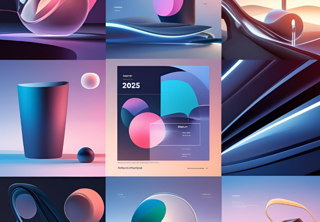
The Definitive Graphic Design Color Trends for 2025
This year, we’re seeing a beautiful duality in color. On one side, we have rich, saturated earthy tones that ground us in nature. On the other, we see the rise of dynamic, almost futuristic Hyperpop palettes that buzz with digital energy. Here are the standout colors making waves.
Cherry Red
Bold, confident, and impossible to ignore. Cherry Red is a statement color that exudes energy and passion. It’s perfect for calls-to-action, accent elements in branding, and any design that needs to grab attention instantly.
Butter Yellow
Soft, creamy, and full of optimism, Butter Yellow is a more subdued, gentle version of its brighter cousin. This shade works beautifully in pastel palettes and brings a touch of warmth and cheerfulness, making it ideal for wellness brands, lifestyle content, and friendly UI designs. This has been making waves in color palette trends 2025 as seen in social media.
Ethereal Blue
This is a light, airy blue that feels like a calm sky or a tranquil sea. Ethereal Blue is a versatile color that promotes feelings of peace and trustworthiness. It is a fantastic choice for corporate branding, tech companies, and health-related UI/UX design trends. Ethereal blue is chosen in color palette trends 2025 to showcase luxury.
Aura Indigo
A mystical and deep shade, Aura Indigo sits between blue and violet. It evokes a sense of wisdom, creativity, and a touch of luxury. This color is perfect for creating a monochromatic color palette with depth or for brands that want to appear both innovative and sophisticated.
Dill Green
Moving away from the zesty limes of past years, Dill Green is a savory, organic green. It’s a core component of the move towards earthy tones, connecting designs to nature, sustainability, and wellness. It’s perfect for packaging, branding design for organic products, and any visual that needs a touch of grounding realism.
Alpine Oat
A warm, neutral off-white, Alpine Oat is the versatile foundation of many 2025 color trends. It’s calming, sophisticated, and pairs beautifully with more vibrant colors. Use it to create clean, minimalist designs or as a balancing element in more complex palettes.
Burnt Orange
Another anchor in the earthy tones trend, Burnt Orange is warm, inviting, and a little rustic. It carries a hint of nostalgia while still feeling contemporary. This color is fantastic for lifestyle brands, travel-related digital illustration, and creates a cozy, approachable atmosphere.
Moonlit Grey
This isn’t your average flat grey. Moonlit Grey has cool undertones of blue and lavender, giving it a modern and high-tech feel. It serves as a sophisticated neutral that pairs exceptionally well with the brighter shades on this list, like Cherry Red or Aura Indigo, providing a sleek backdrop for tech-forward design and cutting-edge logo design inspiration.
Integrating the 2025 Color Trends Into Your Workflow
Harnessing these graphic design color trends is about more than just picking a new swatch. It’s about thoughtful integration.
- Experiment with Palettes: Combine these colors to see what works. Pair the boldness of Cherry Red with the stability of Moonlit Grey. Create a soothing trio of Ethereal Blue, Alpine Oat, and Dill Green.
- Consider Context: A color that shines in a digital illustration might feel different in a UI/UX design. Always test your palettes in their intended application.
- Stay Authentic: The most important trend is authenticity. Use these color palette trends 2025 to enhance your unique design voice, not to replace it.
By embracing the 2025 color trends, you position yourself as a forward-thinking designer ready to create work that is not only beautiful but also culturally and emotionally resonant.