Spotify has improved its UI experience by introducing an immersive environment. Its UI made the music-searching experience memorable, making it a titan of the music industry. The vibrant visuals around the playlists and how it presents dynamic content show its expertise in modern UI designs.
Spotify’s algorithms show new genres to listeners, curated to their preferences and previous search hits. The information is displayed on an intuitive layout, the user journey is so smooth that even first-time users will enjoy their time here. Why do we like it? Because of its dark interface, it’s such a relief for the eyes.
The brand managed to maintain a cohesive structure over the years, despite adding new artists and albums to the platform. Also, its responsive design and easy navigation allow you to have a seamless experience on any device you are streaming music.
In this blog, we will analyze some modern UI designs and how brands implement them in their branding.
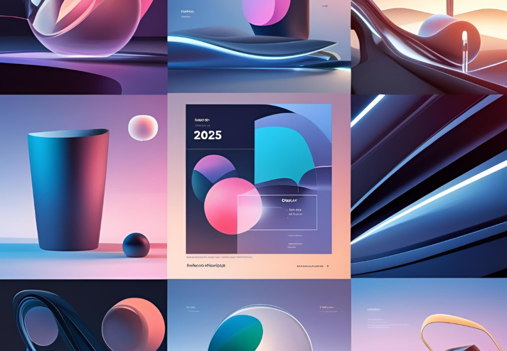
Interactive 3D Elements
Interactive 3D elements enhance user engagement by allowing real-time manipulation of objects within the interface, providing a more immersive experience.
Brand Implementation:
- Nike: Nike’s product pages now feature 3D models of sneakers as a modern UI design that users can rotate and zoom, offering a tactile shopping experience. This approach bridges the gap between online and in-store shopping.
- Cognito: Cognito’s homepage showcases morphing 3D avatars that respond to user interactions, creating a dynamic and personalized browsing experience. This is another nod to interactive 3D elements, as modern UI designs.
- Implementing interactive 3D requires balancing visual appeal with performance optimization. Tools like WebGL are utilized to ensure smooth interactions without compromising load times.
These modern UI designs provide a hands-on feel, making digital interactions more engaging and informative, especially when evaluating products online.
AI-Powered Adaptive Modern UI Designs
AI-driven interfaces adapt to user behavior, preferences, and context, offering a personalized user experience.
Brand Implementation:
- Pinterest: Pinterest’s interface dynamically adjusts the layout and content based on user interactions, ensuring that the displayed pins align with the user’s interests and browsing history.
Designing for AI adaptability involves creating flexible components that can rearrange and resize based on algorithmic decisions, ensuring consistency across various user scenarios.
Users benefit from modern UI designs where content feels curated, reducing the effort needed to find relevant information or products.
Kinetic Typography
Kinetic typography involves animating text to convey messages dynamically, enhancing storytelling and user engagement.
Brand Implementation:
- Mailchimp: Mailchimp employs animated headings and call-to-action buttons that guide the user’s attention and make the interface more lively and interactive.
- Hello Monday: Their website features flowing text animations that create a narrative experience, making content consumption more engaging. While working on brand packaging, designers need to focus on modern ui designs.
Incorporating kinetic typography requires careful timing and motion design to ensure that animations enhance readability and do not distract the user.
Animated text elements make interfaces feel modern and can help in emphasizing key information, improving overall comprehension.
Progressive Blur Effects
Progressive blurs are used to create depth and focus within an interface, subtly guiding user attention to active elements.
Brand Implementation:
- Notion: Notion uses background blurs in modal windows to keep the user’s focus on the active task while maintaining context with the underlying content.
- Dropbox: Dropbox applies blur effects to dropdowns and tooltips, enhancing visual hierarchy without overwhelming the user.
Implementing blur effects requires balancing aesthetics with performance, ensuring that the visual enhancements do not hinder interface responsiveness.
These modern UI designs help in focusing attention and reducing visual clutter, making interactions more intuitive.
Bento Grid Layouts
Bento grids organize content into modular, asymmetric blocks, allowing for a dynamic and responsive layout that enhances content discoverability.
Pinterest: Pinterest’s adoption of bento grid layouts allows for a more flexible and visually engaging presentation of pins, adapting seamlessly to various screen sizes.
Designing bento grids involves creating a system that accommodates diverse content types while maintaining visual harmony and responsiveness.
Users experience a more organized and aesthetically pleasing interface, making content exploration more enjoyable with these modern UI designs.
Modern Skeuomorphism (Neumorphism)
Modern skeuomorphism, or neumorphism, combines the tactile feel of skeuomorphism with the simplicity of flat design, using soft shadows and gradients to create depth.
Brand Implementation:
- Apple: Apple’s iOS apps incorporate neumorphic elements, such as buttons and sliders with subtle shadows, enhancing the tactile experience without compromising minimalism.
- Sony: Sony applies neumorphism in its music and gaming apps, providing a soft, tactile interface that enhances user interaction.
Neumorphism and related typography requires meticulous attention to lighting and shadow to create a realistic yet subtle 3D effect that aligns with modern design sensibilities.
The tactile visuals make interfaces feel more interactive and intuitive, improving user satisfaction.
High-Fidelity Illustrations & Character-Led Interfaces
Detailed illustrations and character-driven designs add personality to interfaces, fostering emotional connections with users.
Brand Implementation:
- Mailchimp: Mailchimp uses expressive illustrations in success messages and error prompts, making interactions more personable and less transactional.
- Cognito: Cognito’s onboarding process features animated characters that guide users through the setup, creating a friendly and engaging experience.
Creating high-fidelity illustrations involves a balance between artistic expression and functional clarity, ensuring that visuals enhance rather than distract from the user experience.
Character-led modern UI designs make interfaces feel more approachable and can simplify complex processes through visual storytelling.
Scroll-Driven Narrative Interfaces
Scroll-driven narratives transform the scrolling action into a storytelling mechanism, where content and visuals evolve seamlessly as the user navigates.
Brand Implementation:
- Hello Monday: Their website employs scroll-triggered animations and transitions that guide users through a narrative journey, enhancing engagement.
- Dropbox: Dropbox’s case study pages utilize scroll-based storytelling to present information in a structured and compelling manner.
Designing scroll-driven narratives requires a cohesive flow of content and visuals, ensuring that each scroll action contributes meaningfully to the user’s understanding.
This approach provides an immersive experience, making content consumption more interactive and memorable.
The modern UI designs are characterized by a blend of user-centric approaches. Brands that effectively implement these trends not only enhance visual appeal but also improve functionality and user satisfaction. As a graphic designer, understanding these trends thoughtfully can lead to more engaging and effective designs. For users, these innovations translate to more intuitive, personalized, and enjoyable digital experiences.